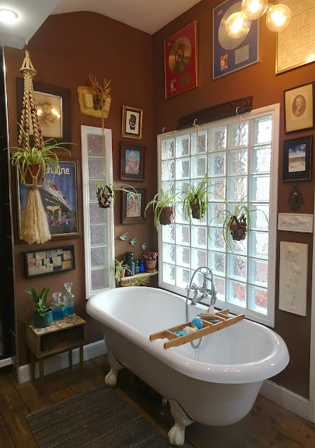
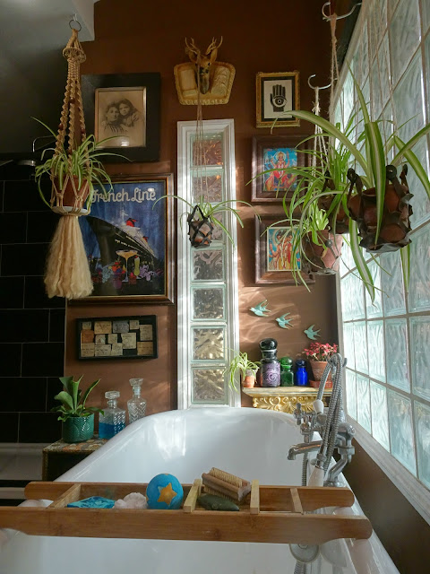
Of all the rooms in our house, the bathroom is the one our visitors (remember them?) say they love the most. Originally a toilet in a room the size of a cupboard, Jon knocked the walls down and started from scratch, creating a bigger space by utilising a third walk-through bedroom and partitioning it off with stud walls and glass bricks.
Whilst installing the walk-in shower he discovered this fireplace, hidden away for decades under a sheet of plasterboard, a surprise to both us and to Mum, who grew up in the house and had no idea that it had been in her bedroom for most of her childhood.
The natural light in the bathroom comes through the landing window and filters through the glass bricks directly opposite. We painted a feature wall in a deep chocolate brown but, concerned that it would make the room too dark, went for white on the remaining walls.
This has irked me for a while. Whilst the white paint does bounce some light back into the bathroom, the walls look cold, clinical and - to be brutally honest - downright boring. No amount of interesting framed pictures or houseplants improve the overall effect.
Shortly after posting our lockdown kitchen makeover post (
HERE) I received an email from Swedish company,
Photowall, saying that they loved our interior style and wondered if we'd be interested in choosing a piece of wall art from their website in exchange for a review on my blog. A quick perusal of their site and I was beyond excited, I'd found the perfect solution to our boring bathroom wall dilemma, a mural called
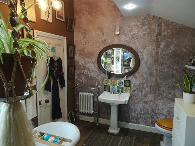
Old Paint Cracked Wall, perfect for a couple as passionate about damaged, decaying and derelict buildings as we are. Who wants pristine white paint when you can have an atmospheric crumbling plaster wall (minus the mess)?
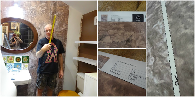
Our mural was printed to order in Stockholm and delivered by DHL less than a week later. We opted for the premium quality paper which was anti-reflective and extra matt although both the standard and premium are supplied with wallpaper paste.
The mural comes on a roll with each section numbered and referred to as tiles, each tile goes up in sequence and has to be lined up accordingly with the last piece you put up. Jon says that if you have a perfectly straight wall, installing the mural would be a breeze, the quality of the paper is astounding and the instructions are clear and easy to follow. Of course, our 270 year old house is wonky and uneven so it wasn't quite as straightforward but, even so, Jon managed to get it done in a couple of days and we absolutely love it!
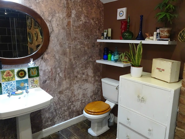
It was hard to tell by looking at the roll but in situ it does look exactly like an aged plaster wall. From being a bit echo-y and cold, the bathroom now feels warmer, atmospheric and more intimate. The pink tones in the mural complement the Jacobean Oak floorboards and chocolate brown paint beautifully and, unlike when they were backed by a white wall, now my Victorian tiles really stand out.
The new radiator looks really good against it, too.
My only issue is that the wooden loo seat now looks very orange, we need to invest in a darker one.
In addition to producing some truly beautiful wall art,
Photowall have an excellent environmental policy. All production is done to order, no products are held in stock or discarded unnecessarily. The printing ink used contains no solvents or hazardous chemicals and is biodegradable. Any waste material generated by the production process is recycled. Each purchase from
Photowall supports the company's work with Swedish development company,
Vi Agroforestry, planting over 5000 trees a year in the area surrounding Lake Victoria in East Africa.
As I mentioned before, I get lots of invitations and offers to promote stuff on my blog but it nearly always gets dismissed. I loved
Photowall's professional but friendly approach (they actually read my blog!) and the quality of their product has blown me away. I think I want to move our bed into the bathroom so I wake up facing this wall!
Photowall are offering all my blog readers a 25% discount on all their products, available until 20th January, 2021 using this code: vintagevixon25








Really beautiful Vix, great choice. I love the look.
ReplyDeletePam in Texas.x
Thanks so much, Pam! xxx
DeleteI'm first!
ReplyDeleteThe bathroom looks amazing! You are so right about it warming up the room - I love the faux cracks in the paper, too. The bathroom looks much cosier and a place where you could spend a lot of time....
Why don't you just sand down and paint the toilet seat white?
Well done to Jon for putting it up so beautifully. We have the same problems with wonky walls and floors and when OH is doing anything to them there is nothing but swearing curse words to beheard!
Hope you enjoy your new bathroom to the max!
xxx
It looks so much more "us" now. I can't believe how realistic that print looks.
DeleteI did consider sanding down the loo seat and staining it in a darker colour but the quality isn't the greatest so I've treated us to a new one! xxx
How absolutely fabulous! Looks much improved and very warm. It is a very unusual bathroom. I do love your style, so unique.
ReplyDeleteThanks, Carole! xxx
DeleteWhat an amazing bathroom. I have bathroom envy now.... Fantastic wallpaper too.
ReplyDeleteThank you! x
DeleteBeautiful! One solution to the toilet seat might be white (I know you hate white) but a toilet seat is really not a feature, that way it would fade into the background. Now that wall suits you way better than the white one
ReplyDeleteThanks, Tammy! I did ponder on both yours and Vronni's suggestion about a white seat but found an amazing suitably vintage looking seat online so I'm treated us to it! xxx
DeleteIt made a lovely bathroom truly spectacular! I hate to over share, but if my daughter lived with you, she'd never leave that room, often taking a book in with her just because it is a quiet and cozy space.-any m bathroom is ugly! She'd never leave yours.
ReplyDeleteThanks, Sam! It's a lot nicest lounging in the tub and admiring that old plaster wall rather than the stark white, it makes me want to take my time. xxx
DeleteGood evening! see I knew it would be worth the wait. Some people have just got it = great taste that is and that's you two! I did not think your bathroom could get any better or unique and now it just looks even better than it did! The paper goes so well with the chocolate brown and as you say it picks up the lovely floor boards. I have a friend who did an interiors course and although she has talent I have decided that what you have cannot be taught. Just in awe as usual Shazxx
ReplyDeleteBless you, Saz! that's such a lovely thing to say! I must admit there was so many amazing designs on the Photowall website I didn't know what to go for but when I spotted that plaster mural everything fell into place! xxx
DeleteWhat a great look! Ready for Architectural Digest! :))
ReplyDeleteWow! I wish! xxx
DeleteThat's really in keeping with your style Vix and it has added a lot of warmth to the wall. I'll have to have a look at their website and see if anything takes my fancy. I'd love a mural wall
ReplyDeleteThanks, Cherie. We're absolutely thrilled with it. I'm very tempted with their forest murals! xxx
DeleteWhat a transformation! I loved your bathroom before, but the mural makes it look spectacular and so much more you! I'm hearing you on the toilet seat, but I'm sure you'll be able to remedy that soon! I'm loving that company's environmental policy too, I can understand why you decided not to dismiss this opportunity. xxx
ReplyDeleteThanks, Ann! It's just finished the room off perfectly. I was so excited to be contacted by Photowall, I'd looked at their website before and loved their stuff & their ethics! xxx
DeleteDet ar jättebra! (That's great) It does look lovely and warm. A dark loo seat will finish it off perfectly. The mirror looks great against it. I agree it really highlights the tiles. xxx
ReplyDeleteThanks, Sally! A new (but vintage looking) dark loo seat is on the way! Hoorah! xxx
Deletewow, so amazing mural and it goes so well with the brown walls and the furniture and style!, this is a brilliant transformation!. I totally agree about the white walls, now there's a different atmosphere, more interesting!, and love that your victorian tiles look so enhanced (they are so beautiful!)
ReplyDeleteLovely post!
besos
Thanks, Monica! Losing that big expanse of white has made all the difference! xxx
DeleteWow! What a DIFFERENCE and it looks like it has always been there, complimenting the floor and brown wall and tiles so well.
ReplyDeleteThanks, Dawn! it really does showcase everything in the room now, doesn't it? xxx
DeleteThat's wonderful. Amazing what changing a single wall can do for a room.
ReplyDeleteI can't believe how different everything looks now, even the sink looks new and exciting! xxx
DeleteHow stunningly beautiful!!!!!! I'm glad Photowall reached out to you, Vix.... it's the perfect solution for your gorgeous bathroom. And that fireplace... oh my!!!!! ~Andrea xoxo
ReplyDeleteThanks so much, Andrea! I'm honoured that they approached me. xxx
Deletejust WOW!!
ReplyDeletethis wallpaper is perfect in this spot - and perfect for your style. love how the tiles, chrome and wood get enhanced..... the company sounds like a nice one.
our bathroom has the same design on all 4 walls - but the messy kind........ we really should get around to renovate it.
xxxx
Doesn't it make a difference? Everything sort of flows now. xxx
DeleteThe photowall is amazing and perfect, just what I would pick. It adds oomph but not enough pattern to tire of it. Jon did a great job. Aren't the Swedish clever? Thank you.
ReplyDeleteThank you. It looks so realistic, doesn't it? I see different markings in that print each time I look at it (which is rather a lot!) xxx
DeleteLooks amazing! What a brilliant product. I agree you need to change the toilet seat for something darker but what a transformation.
ReplyDeleteThanks so much, Maeve! A new loo seat is on the way, that orange pine is really jarring now! xxx
Deletegreat improvement. Looks so "real". I agree that the seat needs to be more walnut instead of golden oak. Another Honey Do project for Jon?
ReplyDeleteI couldn't tell when I looked at the roll but once Jon had the first couple of tiles up I was amazed at the effect.
DeleteThere's a dark wooden seat on it's way to me right now! xxx
Well done to Jon and Photowall, it looks absolutely stunning.
ReplyDeleteThanks, Jayne! x
DeleteMy parents were born in Sweden, I have a boat load of Swedish antiques, they are all over the house.
ReplyDeleteHow fabulous! x
Deleteoh, yes, yes, yes! The wall looks perfect in your bathroom, I love it! It sets off the entire room, the brick wall fireplace shows up better, it just pops!! Love that Jon extended the darker paint around the toilet and shelves. Oh it just looks fantastic and you are right the darker toilet seat will go so well with the oval mirror over the sink. It is so beautiful Vix and Jon!!!
ReplyDeleteThank you so much, Chrystal! I can't believe how much everything stands out now, the room is a lot more coherent and flowing now. xxx
DeleteHow fabulous that wall looks, a crumbling plaster wall is just what's needed but it isn't something you expect to find on a roll of mural! I love it. This does make a huge difference to your bathroom and the pink/gold tones give a lovely warmth to the room. How impressive too that this company are so eco friendly. Orange toilet seat isn't too big an issue, you need a mahogany coloured one to achieve perfection :) By the way thanks for your recent comment about Wilko wallpaper, they have a huge choice and would be ideal to cover the back/inside of my cupboard which I had considered hand painting - which would take about ten years!
ReplyDeleteIsn't it fab? I know what you mean, I always imaged mural to be scenes like Coronation Street's Hilda and Stan's "Muriel" back in the 1970s! It looks so realistic!
DeleteI knew you'd love Wilko's wallpaper, hand painting would take years! xxx
Good on you and Jon, Vix. So typically you to choose something eccentric and fabulous. What a difference that has made to your bathroom. Thank you for sharing. I love it!
ReplyDeleteThank you so much, Catmac! We love it, too! xxx
DeleteGood thing you didn't pass this one up, it was just the finishing touch your bathroom needed. The colours are so much more you than the white , it certainly draws attention to those vintage tiles. I agree a new loo seat is in order .
ReplyDeleteThanks, Jill! I was so excited when they messaged me, makes a change from all those tedious "Dear Blogger" emails from china! xxx
DeleteWow, your new wall looks incredible Vix! I like the look of crackles without the worry of real cracks, if you know what I mean. I've had a look on Photowall's website. Great that it is wipeable (lots of sticky fingers in this house!) & that you can get your own wallpaper printed too. Great job! Lulu xXx
ReplyDeleteThanks, Lulu! I'm amazed by it, I keep rushing upstairs and staring at the wall! xxx
DeleteOh, that is beautiful, Vix! Well done Jon - I'm tiling our bathroom floor with vinyl and I know what he means about square walls and wonky bits lol.
ReplyDeleteIn our old, old house - when we took off the thick layers of wallpaper, we got down to distemper and whitewash. It made me feel like we were living in Venice in a dilapidated palazzo lol.
Our new, old house has been 'modernised' through the years but the cellar stairs are just as amazing as our old, old house. Gorgeous. I bet you can find pictures in your wall, the more you stare.
OMG I could have one of my paintings as wall art couldn't I?
SQUEEEE!
Thanks, Elaine! I did think of you when I saw that they could reproduce your own artwork, too.
DeleteThe vinyl flooring sounds very tricky but it will look amazing when it's done. It's just getting it done!
I was so tempted to leave a few of our walls in a dilapidated state, too - back in the day the Laura Ashley homewares catalogue displayed their furniture in decaying rooms, it looked wonderful! xxx
It's a big difference! Magnificent how it enhances the wood of the floors and the beautiful tiles! I like the company's attention to nature!
ReplyDeleteHugs, Carmela
Thanks so much, Carmela! xxx
DeleteI absolutely LOVE it, Old Plaster Walls are Divine... reminds me of Old Havana Style. Turned out Lovely and I'm sure you'll give them a stellar Rating on their wallpapering, it looks so authentic!
ReplyDeleteI adore that crumbling grandeur, like the old Colonial era buildings in India. There's something magical about a bit of decay! I'm so impressed. xxx
DeleteVery impressed with the look of that mural - it really does look like a real crumbling plaster wall! It suits the rest of the bathroom perfectly and definitely warms up the space more than the white wall.
ReplyDeleteI can't believe how much of a difference a few sheets of paper have made to the warmth and ambiance of the bathroom! xxx
DeleteWow, this is amazing, absolutely beautiful!! It really does look like a crumbling plaster wall! Congratulations to Jon, he's done a great job! I've just had a quick look at their website, some really beautiful artwork, very tempting!! As a member of Greenpeace, I Love the fact that the company are so environmentally friendly. Wonderful! xxx
ReplyDeleteThanks, Diana! I loved the design but the company's bang-on ethics were the real deal breaker! xxx
DeleteIt looks absolutely amazing. I love it. X
ReplyDeleteThanks, Jules! xxx
DeleteOh Vix, what a bathroom, it is just beautiful and everything fits and matches perfectly, I’m blown away, honestly. I go along with your other friends here, who say a mahogany loo seat would be just right and would also match the mirror frame too. What a great post to be viewing on this bitter cold evening. Keep Warm and Well,Brummie Sue Xx.
ReplyDeleteThank you, Sue! That wall art has just finished it off and we're really happy now - minus the orange loo seat! Isn't it lovely to see some sunshine this morning? It's been grim lately! xxx
DeleteWow, Vix! Your bathroom looks great. I would have never thought to add wall art to a room. X
ReplyDeleteThanks, Jess! x
DeleteAmazing. Both you and John should have our own show.
ReplyDeleteStay Safe and coffee is on
Thanks, Dora! xxx
DeleteWhat a fantastic difference it’s made and what a brilliant product and company. It looks really good, well done Jon.
ReplyDeleteI did chuckle when you said mural, I automatically thought of Hilda’s mural on Corrie all those years ago. And now you and Jon are our very own version of DIY escape to the chateau. Them tv folk need to discover you two xxx
Isn't it gorgeous? Like you, I always thought of Hilda and Stan when anyone mentioned murals! xxx
DeleteThe Photowall is less clinically white than any bathroom wall treatment I've seen -- without afflicting my eyes with 'cute' fishies named Nemo -- and I like it even more than the Swedish Forest photo mural in the vet's clinic and the moonscape in a very young friend's bedroom. How fortunate you are to have space for a suitable chair in your bath! I've one in mine at last, and consider it essential equipment for those self-care afternoons. (Don't giggle, young women, it's a scientific fact that one's toes grow further away as one ages.)
ReplyDeleteOnce I saw that aged plaster mural I knew it was the answer. We've stayed in a few heritage places over the years with bare plaster walls and I just love the effect, the tones and markings seem to change every time I look at it!
DeleteYes, a chair is an essential in the bathroom, standing on one leg to dry a foot gets more and more hazardous over the years! xxx
That’s just fabulous! It’s really improved an already gorgeous room. I’m going to have a look at their website tomorrow xx
ReplyDeleteThanks, Annie! You could lose hours on the Photowall website, there's about 20 designs I'm in love with and don't get me started on the canvas prints! xxx
DeleteDoesn't it look marvellous! How wonderful that they contacted you- they are right up your street- you've mentioned Swedish things a lot on here and they really suit your wonderful bathroom! I like their eco-credentials too- that's great. I actually think CBC was looking at their website a few weeks ago, looking at this lovely mountain range wallpaper mural- interesting that discount...
ReplyDeleteLOVE IT! What an excellent idea instead of painting the wall! It really suits your home and the space, although I agree, you need a new toilet seat! Good job on installing it, Jon!
ReplyDeleteI didn't think your bathroom could be improved but this just takes it to another level! It's stunning!
ReplyDeletexx